Thursday, April 11, 2013

Some of my other works

This piece is mixed graphite, charcoal, ink and conte on paper

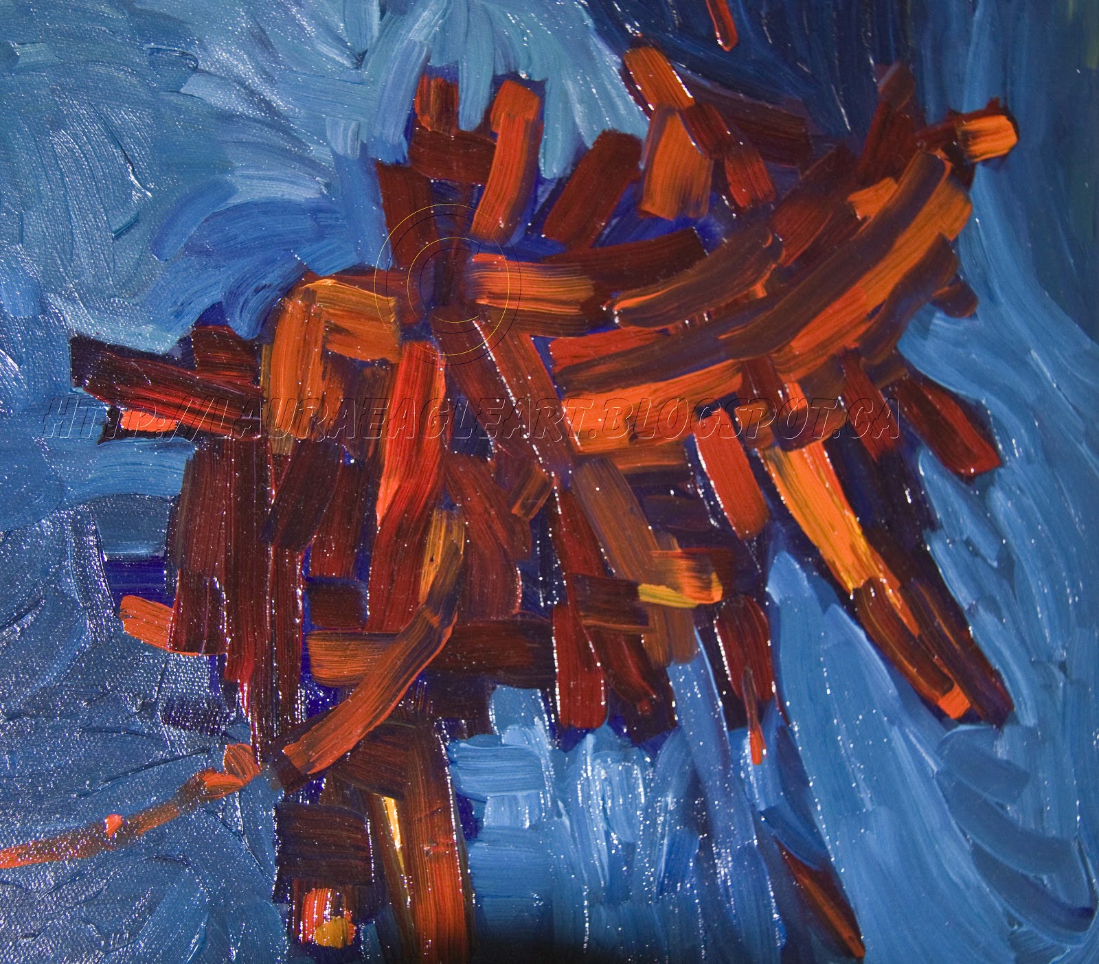
This is a detail of the painting below called ‘Abstract Fall Leaves’

"Abstract Fall Leaves" – Shown in the Sidney Fine Art Show 2008

“Fishing Boats Campbell River” – Shown in the Sidney Fine Art Show 2012


“Orange Poppy”
This painting is currently showing in the Look Show in Victoria, BC April 11-27th on the 3rd floor of the Bay Centre.        Hope to see you there!

“Prairie Storm”

This is a painting from 2008. I had the pleasure of driving across the prairies during the Fall and got lots of wonderful photos to use in my work.  This particular scene unfolded as we drove and I first sketched it then we stopped and took photos as it was just breathtaking to see.  The fields had been cut but were still a lovely gold colour.  Below is a detail of the painting to show colours and movement in the clouds.

”Girl With Poppy In Her Hair”
This painting is from the Poppy collection, painted in 2008 and part of a series that is still being expanded on.  Look for more in this collection soon.

New Work

The Blue Bridge:
I have been working on a series on the ‘blue bridge’ which is soon to be torn down and a new bridge will take its place.  It will be missed!  I am using a different media for each piece and for the two shown here I am showing the process as well.  I love working with mixed media and switch back and forth between working in oils and some sort of paper media often.   I started with photos that I took in black and white several years ago using an old Minolta camera and film.  I have been working  from these photos and have completed two paintings so far.  The two Blue Bridge paintings below are in the Look Show currently showing at the Bay Centre in Victoria, BC April 11- 27th on the 3rd floor.
Stage one of ‘Blue Bridge One’ – mixed media collage and acrylic:
This the second stage where I began adding more layers of colour and stenciled in the basic shape of the iconic blue bridge structure.  I purposely made it larger than it really is to emphasize how it has taken such a central focus in our city in recent months due to its impending demise. 
Stage three I have added more paint to the sky area and its beginning to take shape.  I have added pastel to draw in some of the lines of the bridge and the buildings and light posts at the intersection in the background near the bridge.  The scene is also a night scene so it is dark and moody with light and colour cast into the clouds from the city lights and I am trying to get that idea into the sky – the beginning at any rate.
Stage four:  it’s coming along quite well and I am adding more paint and thinking about it….
By this time (stage five) I have added reddish orange to the buildings and really like it, so I added it to the bridge structure too and though I loved the look of it and I tend to like giving things different colours than they really have – changing things up and making it interesting – it didn’t really speak to me anymore as the “Blue” bridge and I felt it did have to do that.  I rather liked it though!
So stage six:  I came back to “blue” and added more moody colour to the base of the bridge and the shore area beyond.  Filling it in more here and there.
Stage seven:  Nearly there adding details and now I looked at the heaviness of the bridge structure and how I didn’t think it went with the rest of the painting style very well so I decided to leave it for a few days and think of what I wanted to do.
Final painting:  In the end the bridge was glazed in blues and some black was added here and there and also some hints of red to tie it in with the rest of the painting.  I can always see areas to improve on and do differently next time and there will be more paintings of the bridge to come.
While I painted this painting I also worked on a watercolour collage mixed media piece called ‘Blue Bridge Two” and it is detailed here as well.

Blue Bridge Two:
This is the final painting in its frame.  It is glazed with a clear gloss medium as it is not under glass in this frame.
The following photos show the process which consists of building up the watercolour paper with layers of torn watercolour paper in varying weights, to make an interesting texture and to emphasize the subject matter.   I also like to work with a frame as I work on a painting to see how it is looking as I go – setting it in the frame from time to time to get a feel for it.  With some larger paintings this is not always possible.
Graphite, watercolour, charcoal and ink have been used in this painting.

The early stages

Adding more paint and getting things in order

This stage is nearly finished but I realize I need it to be lighter under the bridge so I need to go back in with more collage work.
This is where I add some strategically placed torn paper under the bridge deck in the middle of the painting to give the lightness that is needed for the water there.  Then I add some more watercolour wash as needed to blend it in.
When I learned this technique I was taught that there is really no mistake big enough to ever trash a painting over.  Always save everything and you can always tear up something to re-use later if you really dislike what you created the first time round.  The beauty of working this way is being able to go back in and add layers and fix areas that need fixing and it just “adds” to what is already there.
At this point it is ready for the final glaze to seal it from humidity.  Before I began to paint the paper was also mounted onto a canvas board to facilitate framing.